Gardencup

Gardencup came to us in need of new brand identity to match their wellness-boosting, ready-to-eat salads. BuzzShift delivered a vibrant, edgy brand identity that helped Gardencup stake their claim as a disruptor in the pre-made meal service industry.

Gardencup is a young brand offering garden-fresh salads delivered straight to your door in convenient, ready-to-eat jars. Their mission is to make clean eating attainable and so easy that it’s unavoidable. This bold mission needed a brand identity and messaging to match and to stand apart from a sea of boring meal kit competitors. 

Solution Overview

In a crowded, competitive space filled with minimal branding, BuzzShift and Gardencup needed a unique approach to stand out while still communicating freshness, simplicity, and clean eating. The new Gardencup branding uses bright, playful colors and a friendly, conversational voice along with engaging imagery to attract attention and become memorable to the consumer.

Brand Strategy
Brand Identity
Brand Messaging

Brand guidelines
Packaging design
Homepage Ux/ui

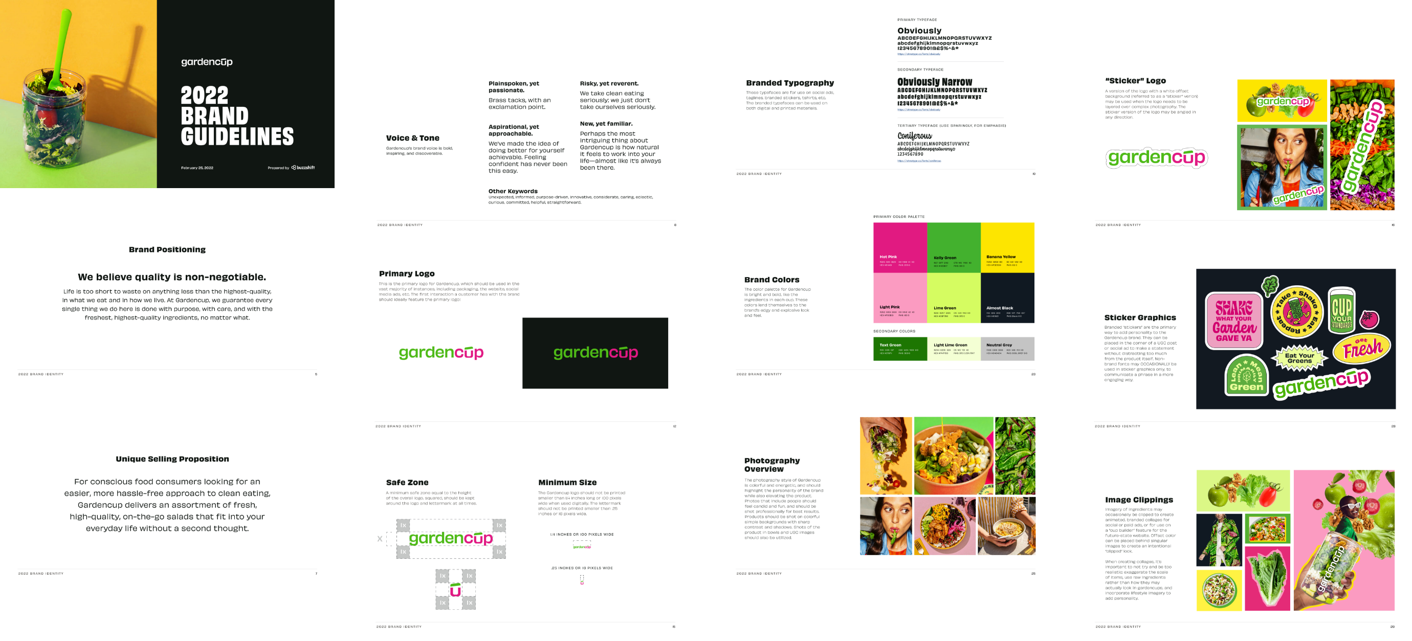
Brand Strategy & Guidelines

Gardencup believed clean eating should be easy, period. Quality should be nonnegotiable and making a positive change for us and others should be simple. Through developing these brand positioning pillars, BuzzShift was able to position Gardencup in the market based on their values and what they want to be known for.  

GC_BrandGuidelines_Desktop
GC_BrandGuidelines_Mobile

Brand Identity

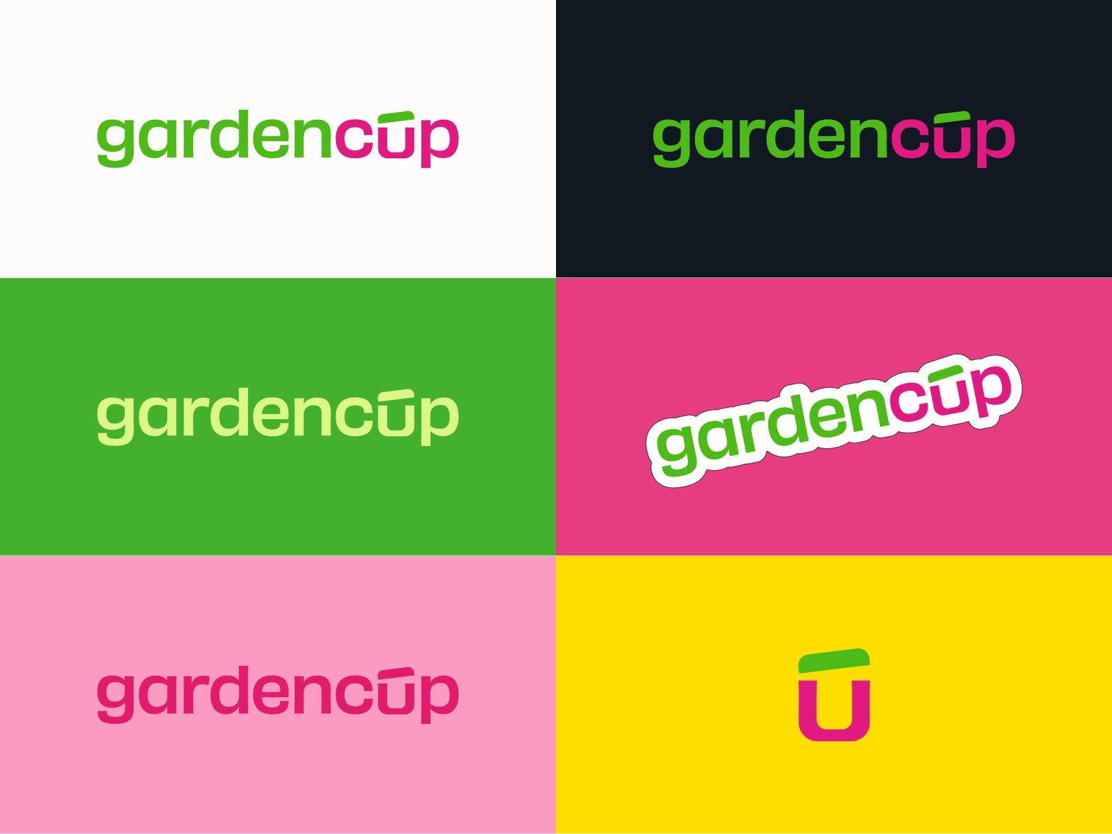
After determining the overall strategy and positioning for Gardencup, BuzzShift took on the challenge of updating the branding to reflect these values. The font and the logo are approachable and easy to read yet has enough personality and quirks to still bring some fun and visual interest. Since green and pink were part of the original brand equity, those colors were used to differentiate the words in the logo mark. Lastly, since Gardencup refers to both the brand and the product, we included an icon of the unique container. Multiple lockups and color variations were also provided to make the logo applicable to a variety of formats for marketing.

Multiple lockups and color variations were also provided to make the logo applicable in a variety of formats for marketing.
Logo_Gif
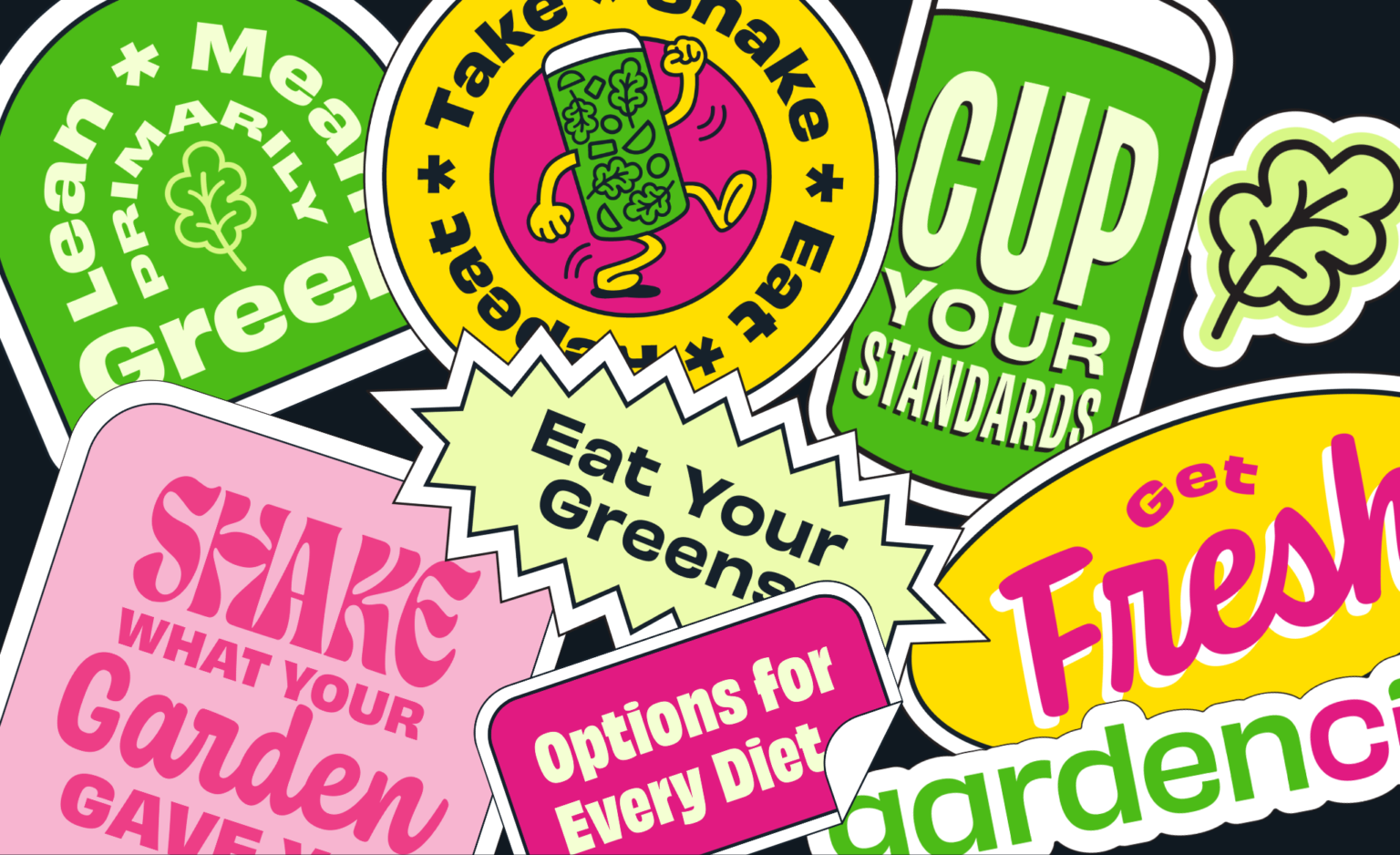
Stickers

Packaging Design

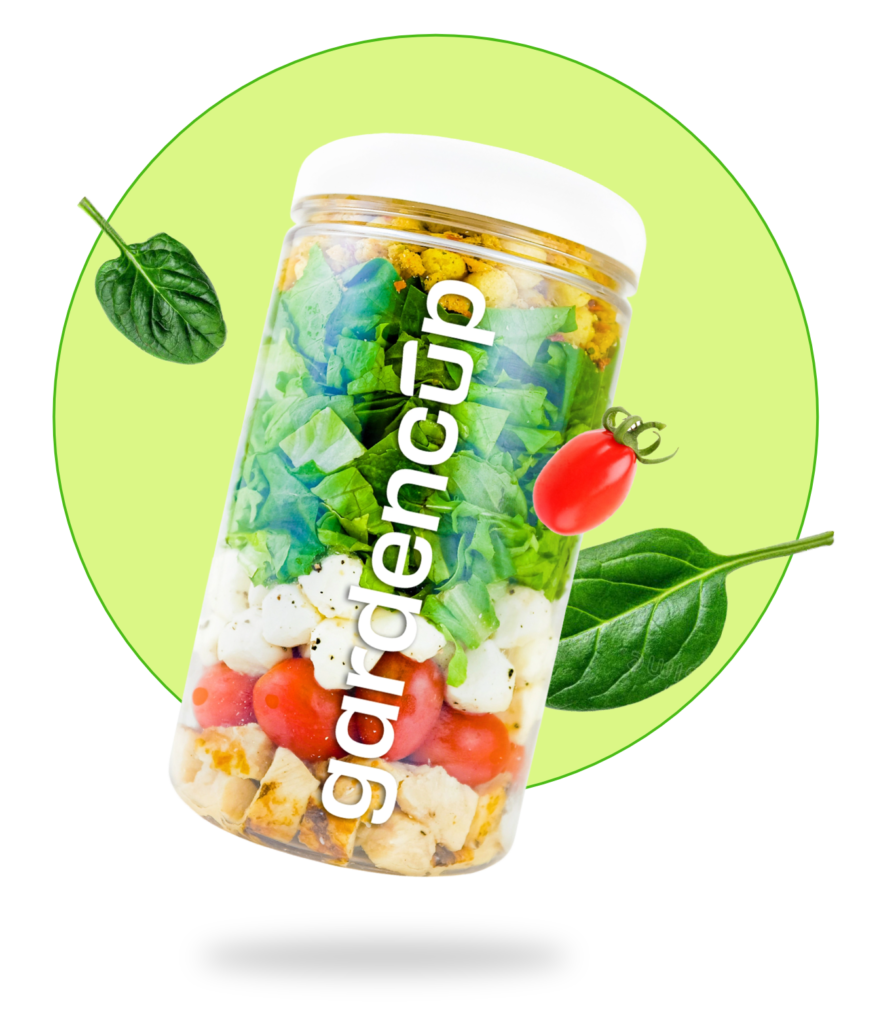
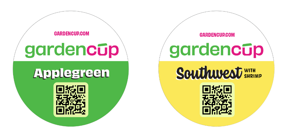
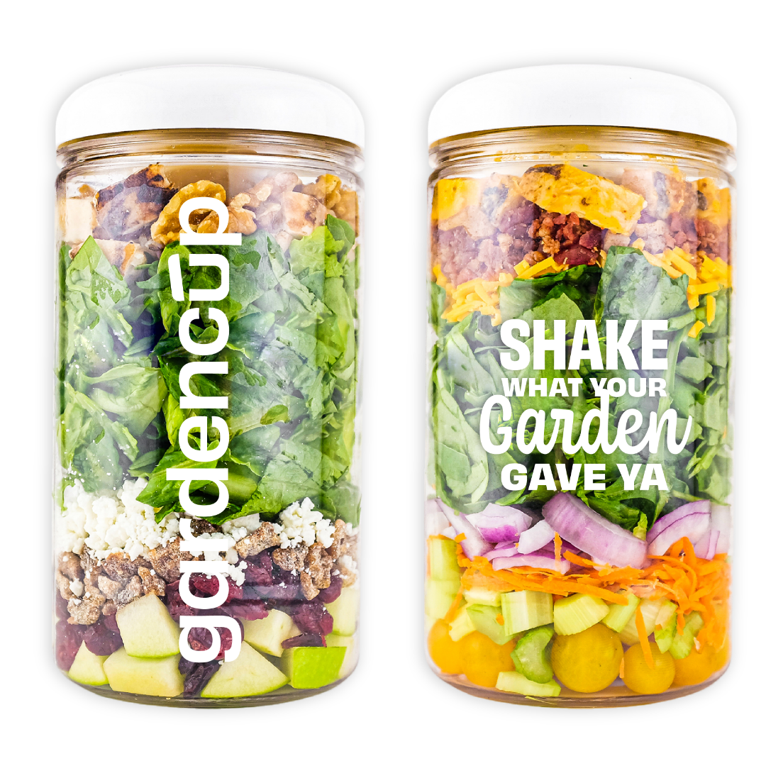
To showcase the bright, colorful layered ingredients in each Gardencup, the packaging design was kept simple and minimalistic with just a logo and brand statement on each side of the jar. Each flavor combination has a corresponding color on the lid label to make them easy to distinguish when shopping in-store.

GC_PackagingTops
GC_PackagingSides

Brand Language

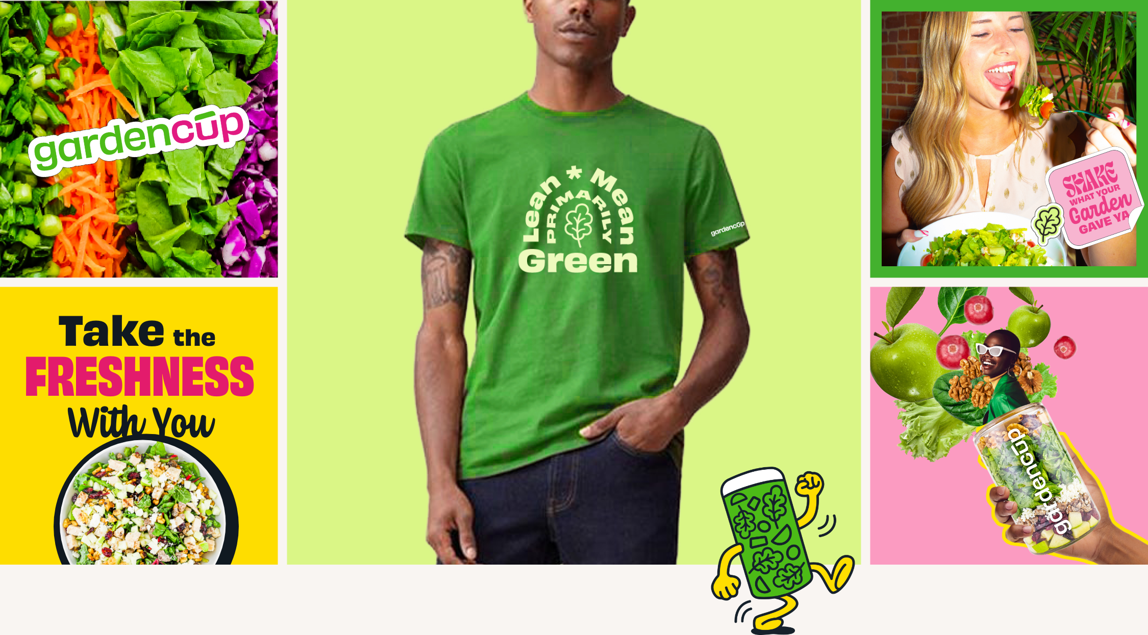
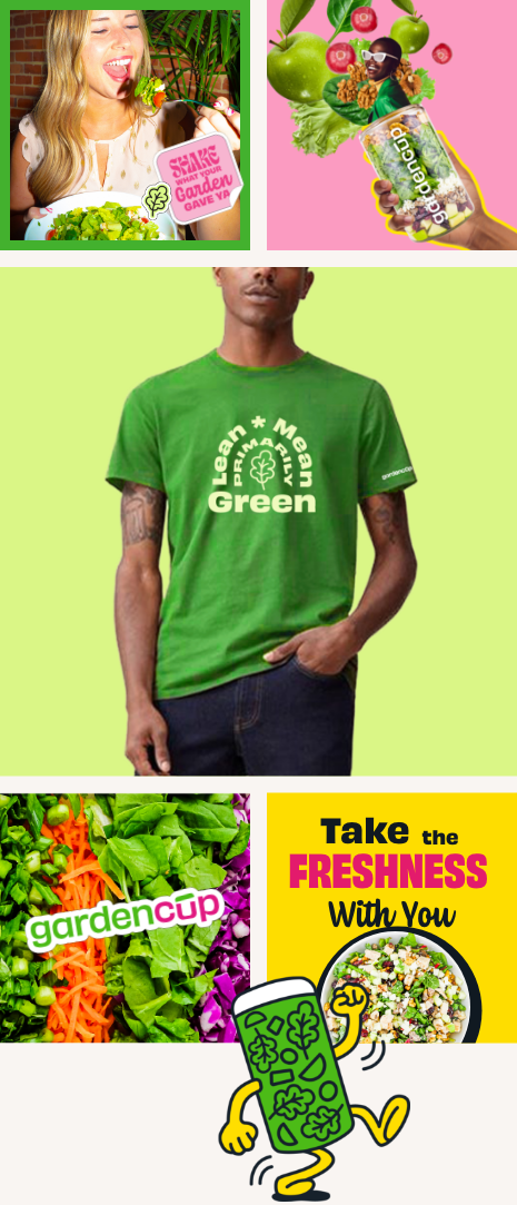
Gardencup’s brand language was developed based their brand identity and how they want to be perceived by customers. They are plainspoken, yet passionate. Aspiring, yet approachable. Risky, yet reverent, and new, yet familiar. They want to show customers that feeling confident and eating well has never been this easy or fun. Visually we accomplished this with bright colors that stand out from the overly white, pastel competitive landscape while communicating the freshness and fun of the product. We also utilized layered collages and messaging that aligns with the layered aspect of the product.

GC Brand Language Desktop
GC Brand Language Mobile

Gardencup Brand Guideliness

Brand guidelines go beyond brand logos and colors to encompass the entire persona of a brand. Take a look at the brand guidelines we created for Gardencup to learn more.