Dong Phuong Bakery

Dong Phuong Bakery came to us wanting to rebrand with an updated look and feel while paying homage to the Vietnamese culture and tradition the brand was built on. From a new logo to a new website, we helped them modernize their brand with a clean, updated brand identity. 

Founded in 1982, Dong Phuong Bakery is a James Beard Award-winning Vietnamese bakery in the heart of New Orleans East offering traditional baked goods, banh mi, and seasonal staples. Their king cakes and mooncakes are now nationally known, and they wanted to increase their brand awareness to further expand their reach and increase conversions.

Solution Overview

Through our growth strategy research, BuzzShift discovered a need to streamline their content and branding on all platforms to present a cohesive and unified brand experience. Our recommendation was to create a new brand identity that remained true to their traditional roots while playing with modern design trends to capture the audience’s attention.

Brand Strategy
Brand Identity
Brand Messaging

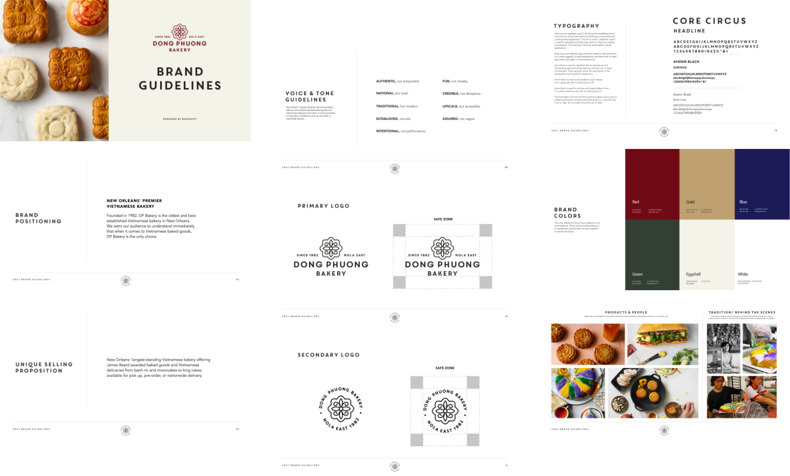
Brand guidelines
Homepage Ux/ui

DP_SolutionOverview

Brand Positioning

After doing a deep dive into the brand followed by a brand positioning workshop, we determined Dong Phong Bakery is authentic, established, and fun. We then created positioning statements to help us best capture how we want thier audience to perceive them and what they want to be known for. In this case, it’s being New Orleans’ premier Vietnamese bakery and a nationally known foodie destination.

DP_BrandGuidelines_Mobile
DP_BrandGuidelines_Desktop

Brand Identity

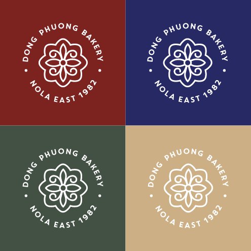
Dong Phuong Bakery came to us wishing to reposition themselves with an updated look and feel to their brand while still keeping with a traditional, established logo. The logo brings in two elements from their brand. The outer shape represents the shape of a mooncake while the inner shape represents the fleur-de-lis, a decorative symbol associated with French heritage and New Orleans. A clean sans serif font was paired with the logo mark to complement it and ensure it doesn’t compete or detract from the traditional look of the logo. The color palette was chosen with traditional Chinese culture in mind, Red symbolizes luck, happiness, and joy. Blue for growth and optimism. Green for wealth and harmony. We also incorporated gold as an accent to represent wealth and riches.
CS-Brand-Positioning-1
CS-Brand-Positioning-2
DP_LogoColors_Mobile
DP_LogoColors_Desktop