Graphic design is more than just brand identity. Good designs are the catalyst brands use to inform and persuade audiences through imagery, color, typography, and form. While core design principles remain consistent, design styles are constantly changing and it’s important to keep up with the latest trends to stay relevant and competitive. In this blog, we’ll take a closer look at 3 of the top design trends we’ve seen take the stage in 2022.
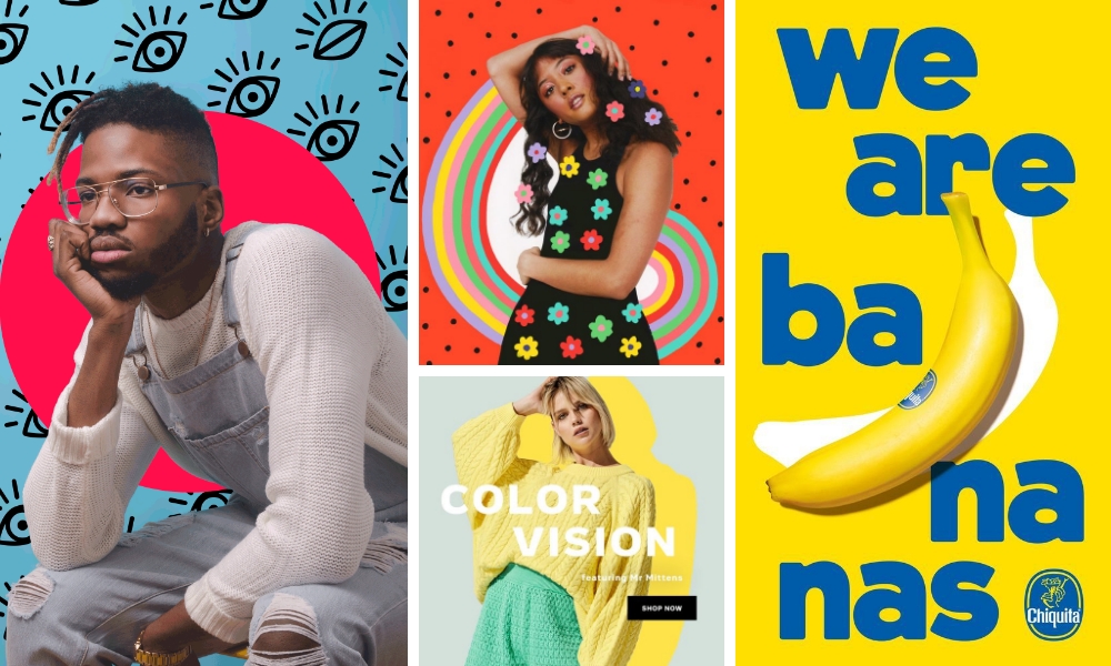
Realism Mixed with Flat Design
Realism consists of adding real-life objects to make design authentic and relatable. Flat designs are simple, two-dimensional shapes and colors. Combining flat visual elements with real-life objects is a new trend that we expect to stick around for a while. This style convergence has appeared in everything from print design to web design and packaging.
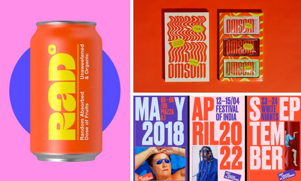
Strong Typography
Strong typography is and always will be a necessity for an objectively good design. Over the past few years, we’ve seen typography getting bolder while still being used as a secondary design element. However, the way bold fonts and typefaces are used in graphic design is changing. Throughout 2022, we have seen bold fonts become more prominent and used as the focal point for a design. This is a significant departure from combining primary visual elements with supporting typography. Type is now often performing the function of capturing the viewer’s attention and playing the role of the art itself. Keep an eye out and you will start to see how this is playing out in social media, graphics, and posters.
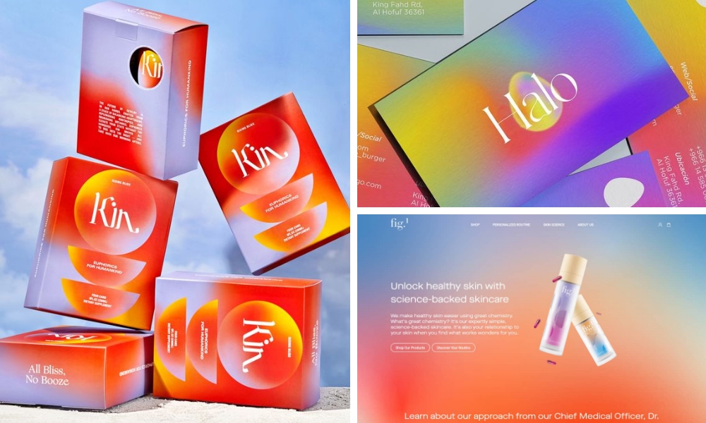
Gradients
Gradients are nothing new, we’ve been using them since the Microsoft Paint days. They have recently made a new emergence with the influence of Gen Z. Within just a few years, what got you a major cringe from designers is now a trendy design choice. The utilization of different patterns and brighter colors being used more frequently is helping to push this trend forward. While gradients are very “on trend” right now, everything has a cycle and we expect gradients will be considered cringey again by the next generation of art students.
Now you see that graphic design is more than just brand identity. Designers put hours of strategic thinking behind their work. Jumping on new trends is not only a way to push creative boundaries but also a good way to keep a brand relevant and competitive in an ever-changing design landscape. Sometimes hopping on new trends can seem daunting, but the trends we discussed above can be used subtly while still adhering to a brand guide and the brand identity as a whole. Whether you are looking to develop your brand identity or need guidance incorporating trends into your content, we would love to help!
About BuzzShift
BuzzShift is a digital growth strategy agency with a focus on mid-market, scaling, purpose-driven DTC Brands. By combining the ideologies of branding, performance marketing, and retention agency, we are able to create memorable experiences with measurable results, and build long-term success for our clients with scalable, sustainable growth. Learn more about BuzzShift.
