When you think of your favorite brand logo, what comes to mind? Nike? Amazon? Netflix? While there is no shortage of well-designed and well-thought-out logos, often big brands that we’ve been exposed to for years or even decades are the ones we naturally think of first. But there are thousands of incredible designs out there you may not have noticed, many that perfectly execute the 2022 logo trends. We wanted to take this opportunity to highlight a few of our favorite brand logos right now from smaller and emerging brands.
#1: Flodesk
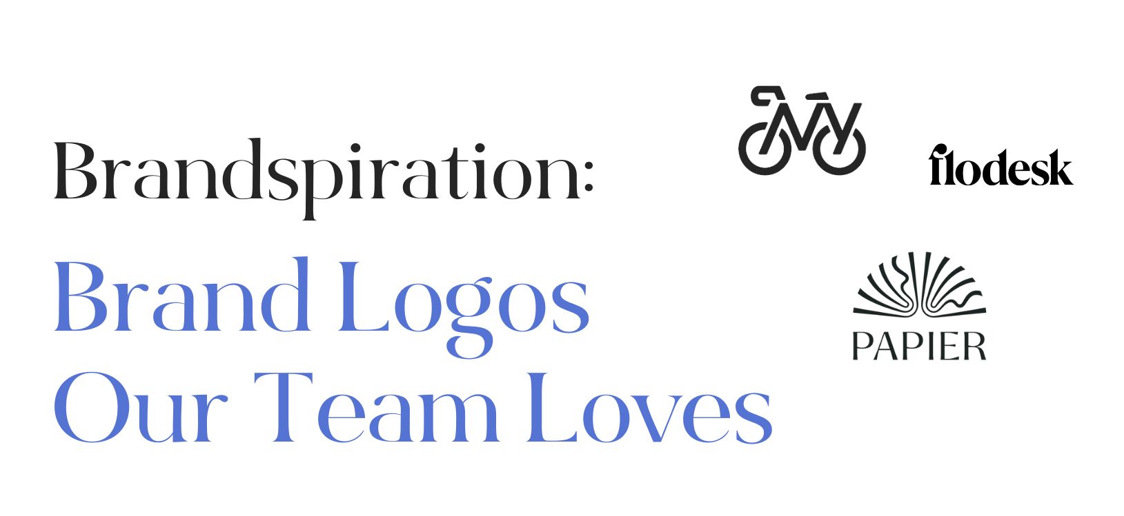
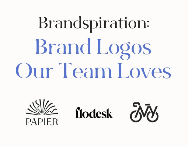
Flodesk is a digital marketing service provider that’s built for creators. A few years ago, the company rebranded and debuted a new logo that has kept our eyes on them ever since. Flodesk’s old logo was a simple typographic logo, and while that can work well, this iteration lacked the personality and pizzazz we are usually attracted to in a brand logo. The new Flodesk logo, however, lends itself to much better brand recognition. It has gone from a simple, sans serif type to a modern serif font with character and personality. The designer emphasized this character with the alteration of the F. This personalized F now can function on its own as a logomark that can be used in social media or other instances where the brand is already recognized. The fact that the F can live separately from the full logotype while keeping brand recognition makes this logo one of our current favorites. Not only do we love their logo, but at BuzzShift, we use Flodesk for our website popups and form fills – here’s a referral code for 50% off your first year (shameless plug).
#2: Papier
Another one of our favorite logos is from Papier. Papier is a stationery company offering everything from journals to recipe books. Unlike Flodesk, this logo combines a logomark with a logotype. The Papier logotype is a clean serif typeface that has style and varying stroke weights throughout the letters. The logomark illustrates an open-page book that symbolizes what the brand is about. The open book icon, like the logotype, has varying stroke weights as well tying the logotype and logomark together seamlessly. This is another example of where the logomark could stand alone on places like social media without compromising brand recognition. This brand gets bonus points for applying the look and feel of their logo to the rest of their branding.
#3: Bike NY
For our last shoutout, we picked Bike New York. Bike New York is all about empowering New Yorkers to transform their lives and their communities through bicycling. This logo is a hidden gem. Taking a quick glance at the logo, you may only see a bicycle. However, if you look closely, you will notice the full visual composition: the letters NY make up the tubes of the bike. This is a clever and compact logo that doesn’t require a logotype with it. It is very recognizable and makes you do a double-take.
These are just a few of the logos that come to mind when we think about our favorite brand logos. As design trends evolve and brands approach logo design and branding from new angles, we’re excited to see what the future holds. Are you looking to level up your logo? With so many options to choose from when it comes to branding design, it’s important to find an agency that understands your brand and wants to see your brand grow. (Plus, brand projects are one of the BuzzShift team’s favorite services to provide!) Reach out today to discuss where you’re at with your brand growth and we can help you decide if we’re the right fit to help take your branding to the next level.
About BuzzShift
BuzzShift is a digital growth strategy agency with a focus on mid-market, scaling, purpose-driven DTC Brands. By combining the ideologies of branding, performance marketing, and retention agency, we are able to create memorable experiences with measurable results, and build long-term success for our clients with scalable, sustainable growth. Learn more about BuzzShift.


